Did you know that the human brain processes images 60,000 times faster than text? Or that visuals result in a stronger reaction and are more memorable than words?
We love turning complex information into beautiful visuals. Diagrams, charts, illustrations, maps, timelines – it’s all about making data easier to understand and enhancing our clients’ websites, reports and other brand assets.
From stats about native species for Conservation Collective to illustrations about cutting deforestation from pensions for SYSTEMIQ + Make My Money Matter, the infographics we’ve created help the brands we partner with to tell their story and demonstrate their social and environmental impact.
The bold data visuals we produced for Energy Profits brought to life the shocking statistics about oil companies and their CEOs profiting at the expense of the planet. We won two Webby Awards for this project – a very proud moment.
We’re keen to share what we’ve learned along the way so we’ve produced a new guide that takes the guesswork out of creating infographics and data visuals and contains examples from our portfolio to inspire you.
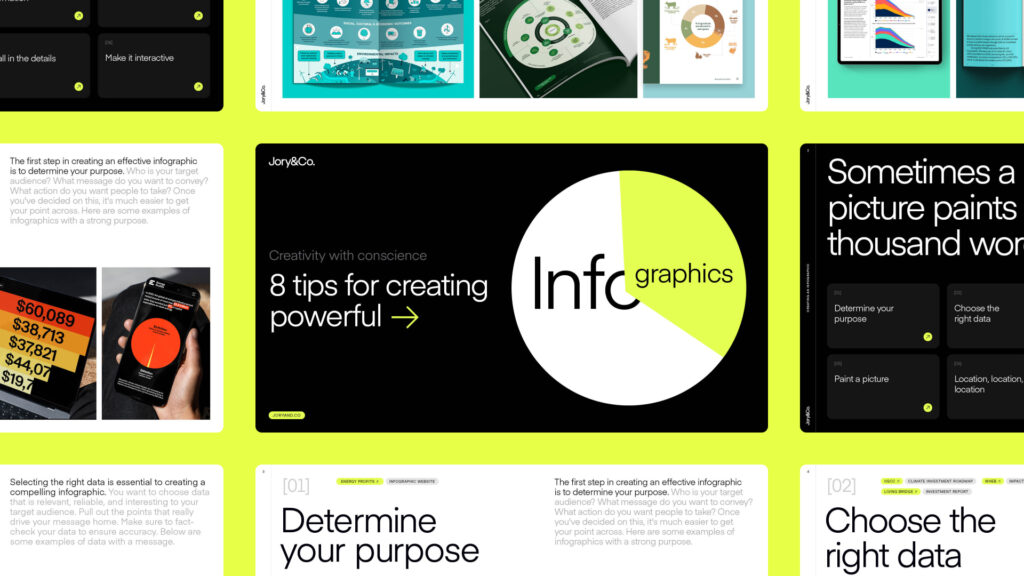
Here’s a quick overview of our ‘8 tips for creating powerful infographics’ guide – you can download the full guide here.
01. Determine your purpose
02. Choose the right data
03. Organise your information
04. Tell a story
05. Paint a picture
06. Location, location, location
07. It’s all in the details
08. Make it interactive
Download the guide and if you’re looking for support with infographic design or data visualisation, get in touch at hello@joryand.co
