“Such a joy working with you and the Jory&Co. team – you completely got us from day one. The brand and website are stunning – bold, thoughtful, and full of heart (just like the DHD Foundation). Thank you for bringing clarity to the chaos and helping us tell our story with confidence and soul.”
The brief
The DHD Foundation came to us at a pivotal point. With a growing network of partners and an expanding footprint across the UK and Sri Lanka, they needed a brand and website that better reflected who they are and where they’re headed.
Founded by Daisy Honeybunn and Pravin Mukhi, the Foundation funds and supports charitable organisations making a long-term difference — particularly in the fields of education, conservation and environmental protection. Their approach is grounded in equity, collaboration and impact. But their existing brand and website weren’t doing justice to the powerful work they were enabling.
Our brief? Create a contemporary new identity and digital presence that clearly communicates their purpose, showcases their partnerships, and helps them tell their story with confidence.
The idea
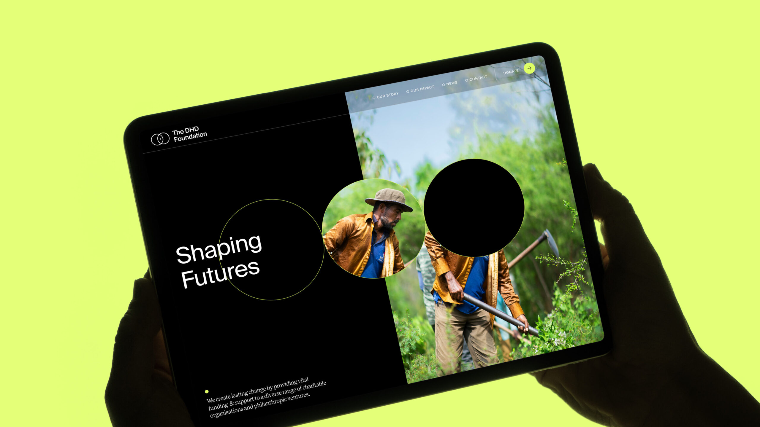
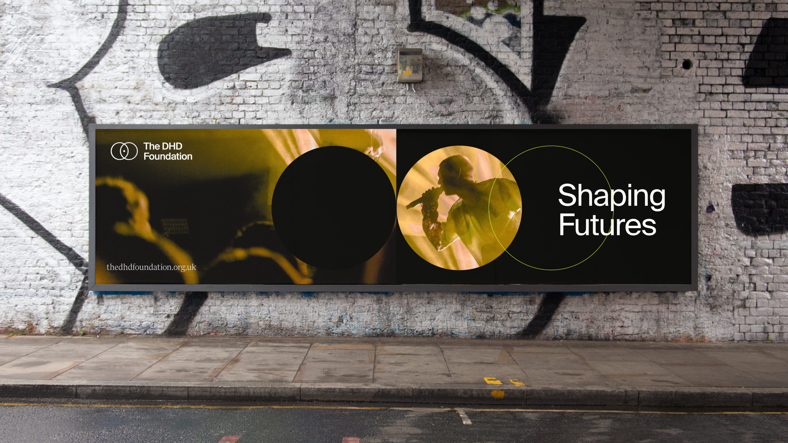
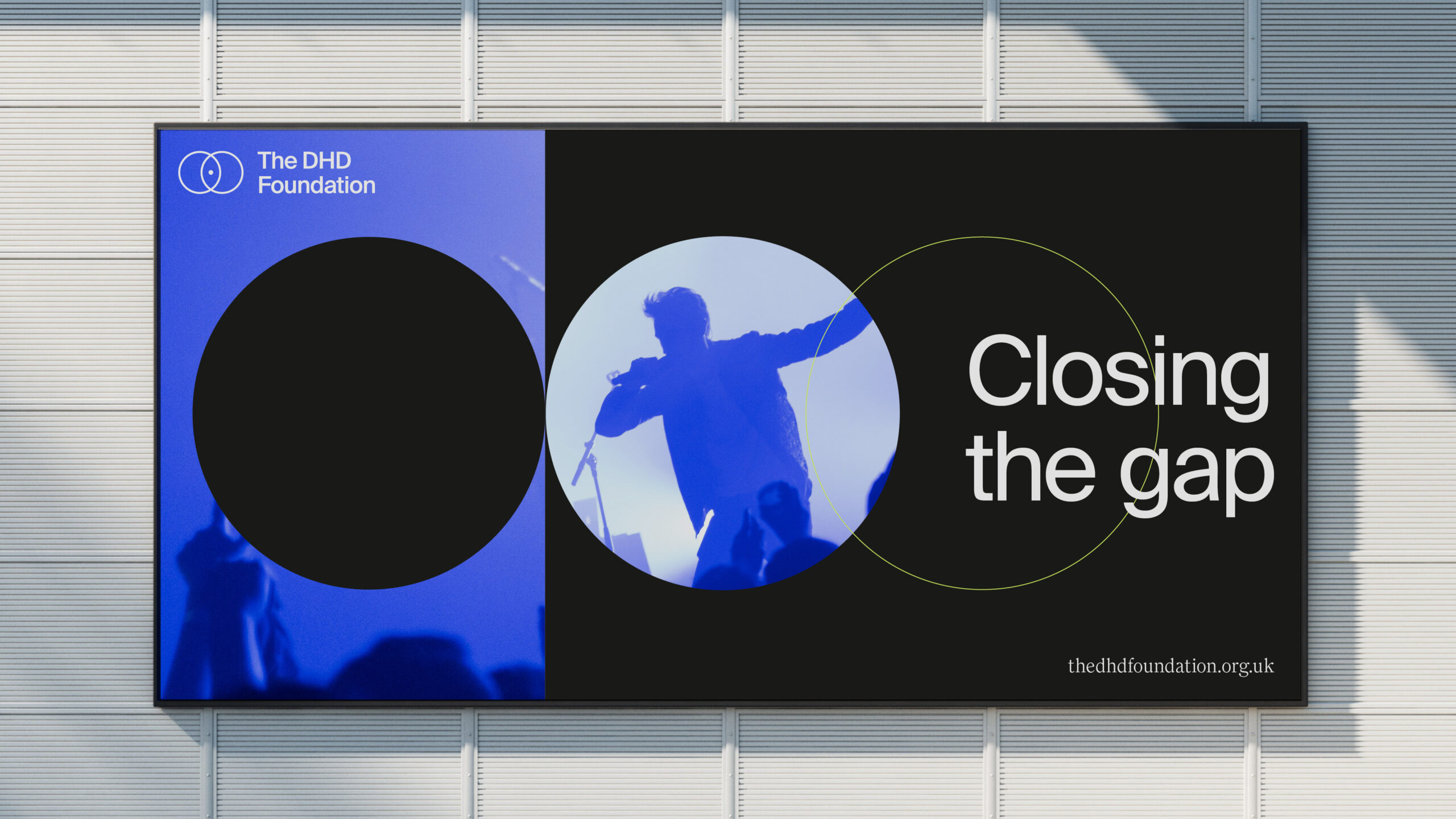
At the heart of the new brand is a simple but powerful creative idea: Shaping futures. Whether it’s helping a child access education or protecting precious biodiversity, everything the DHD Foundation does is about creating the conditions for people and the planet to thrive. We brought this idea to life through a bold new identity — one that balances warmth and clarity with a sense of energy and ambition.
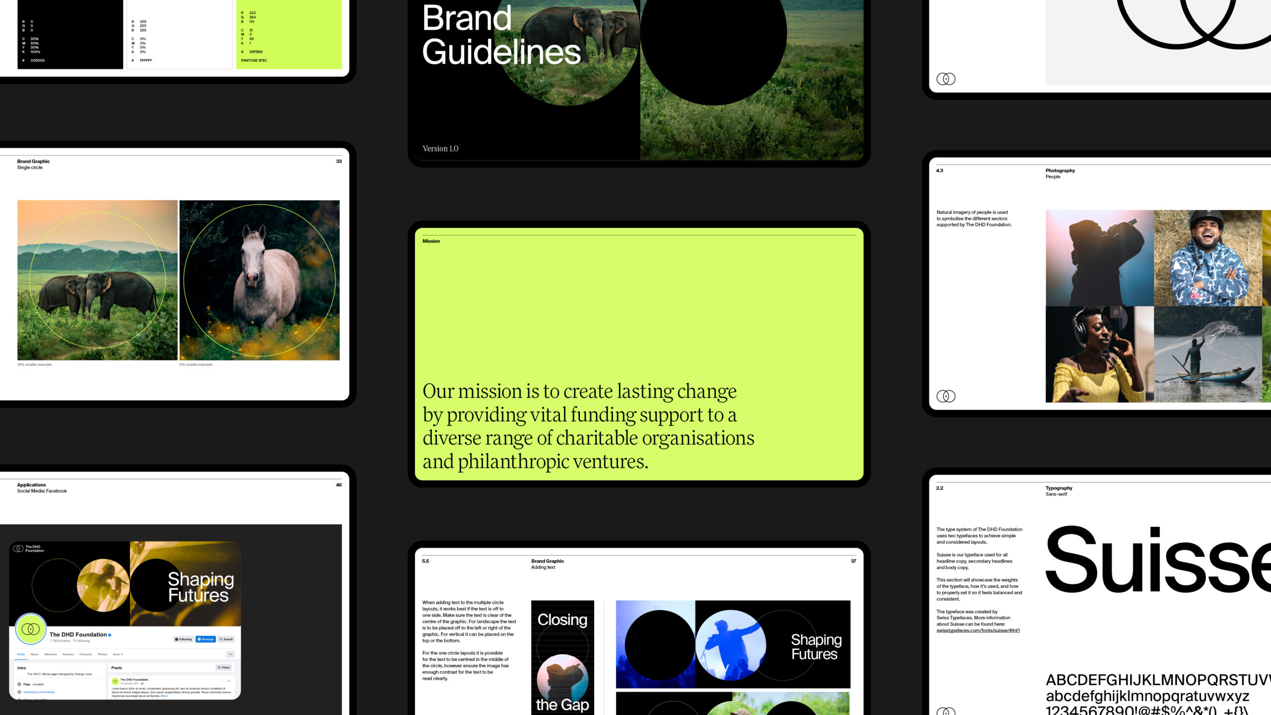
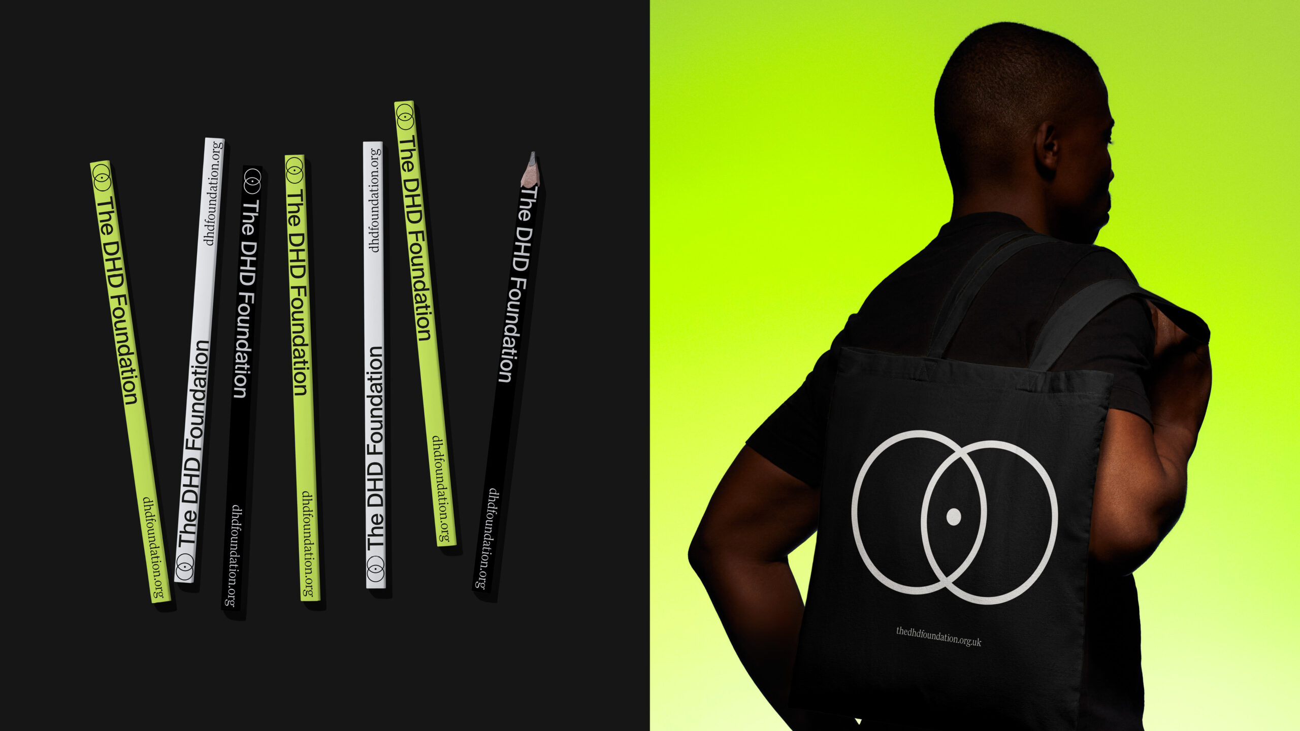
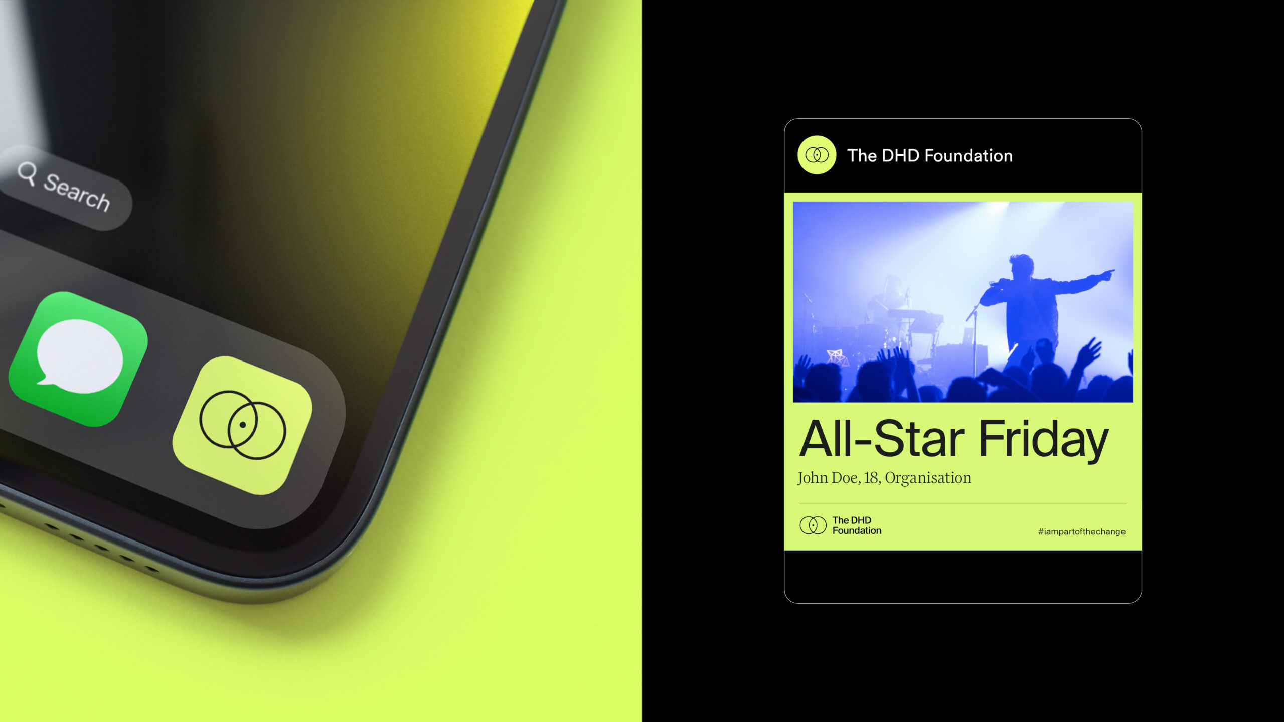
The brand
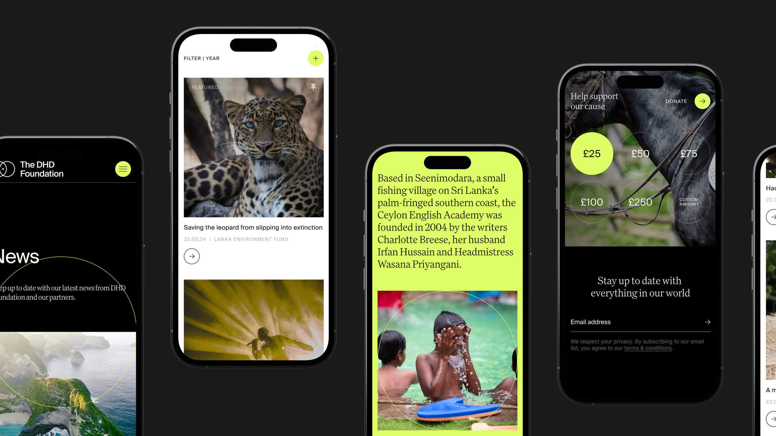
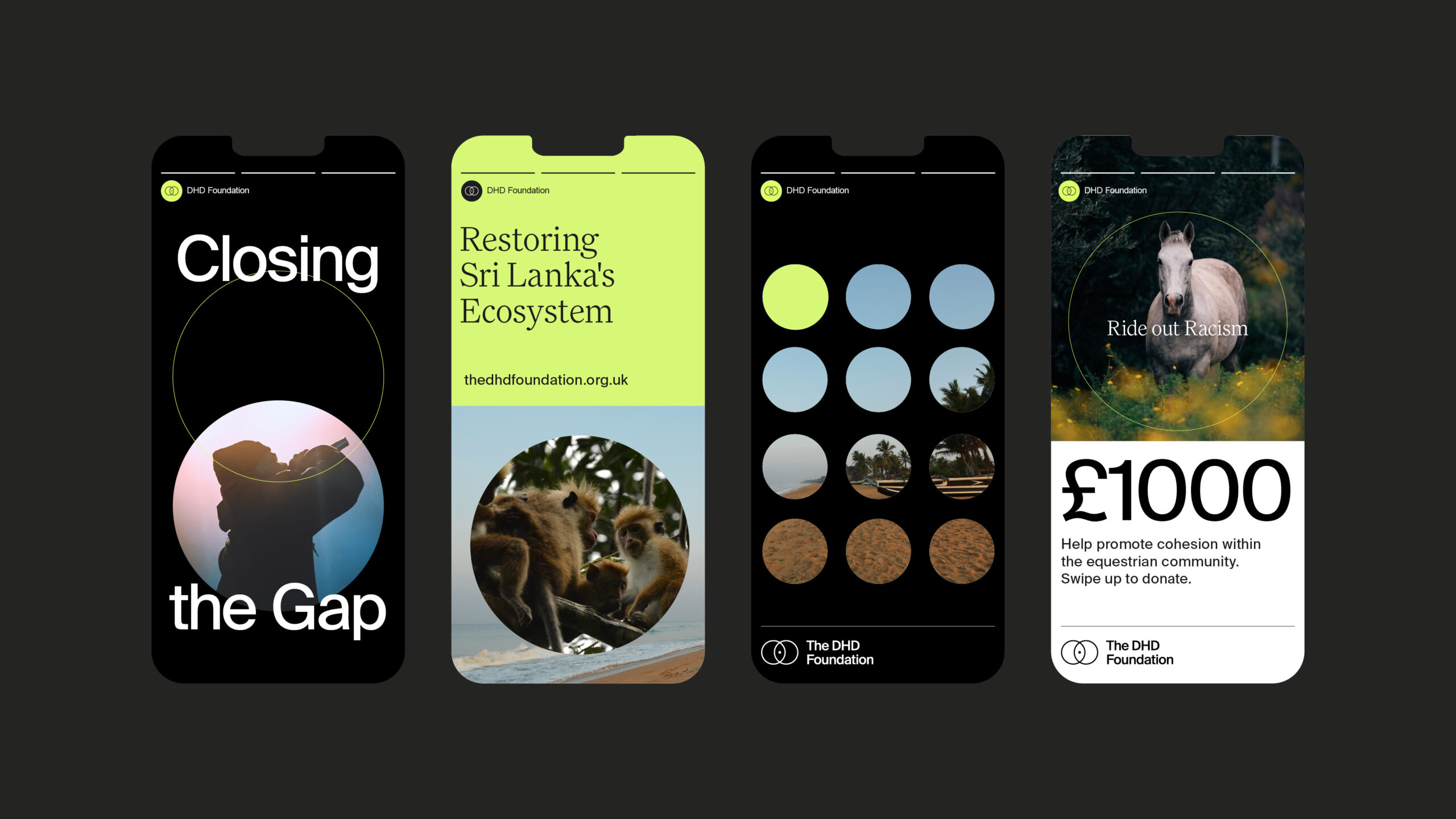
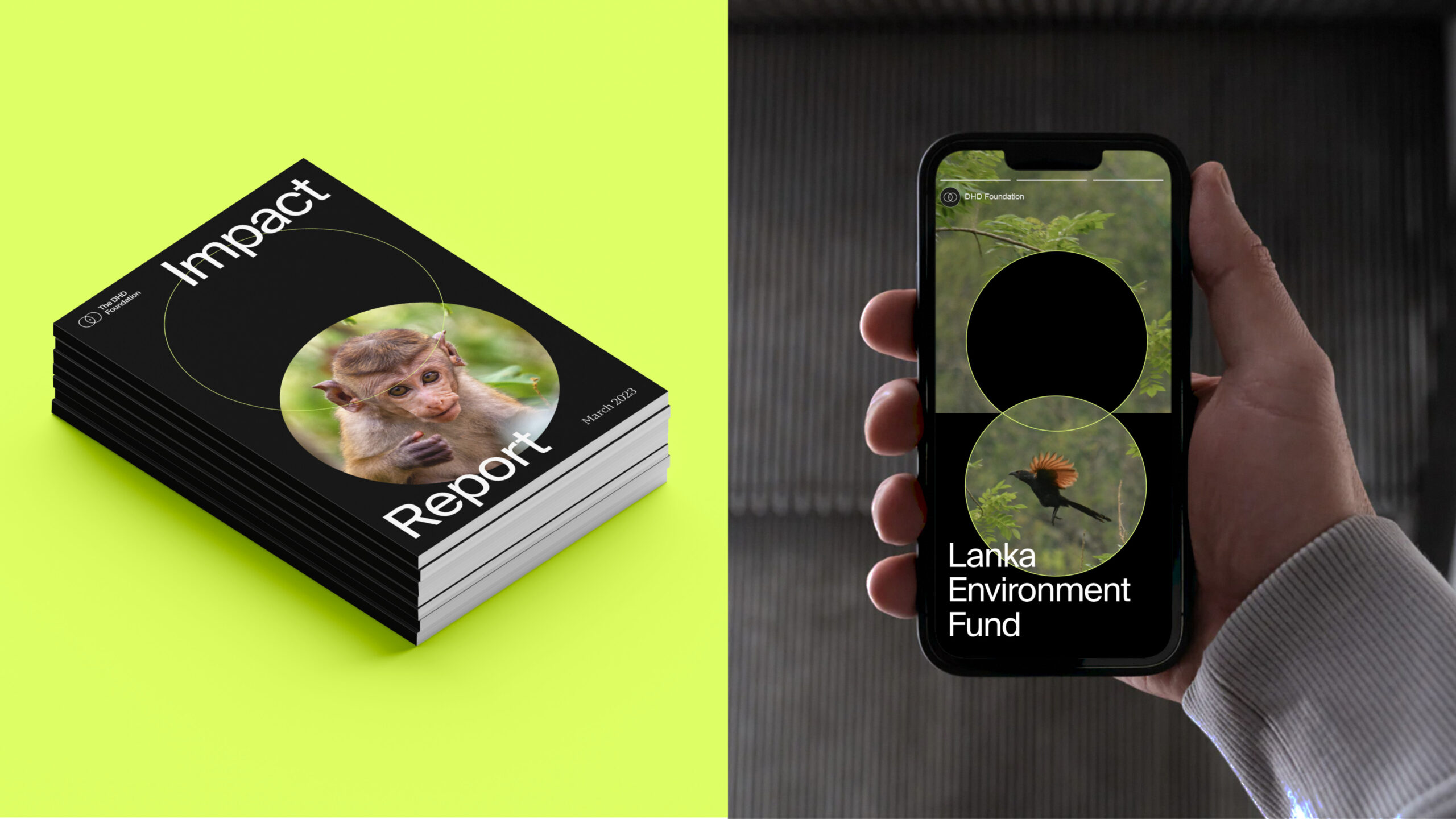
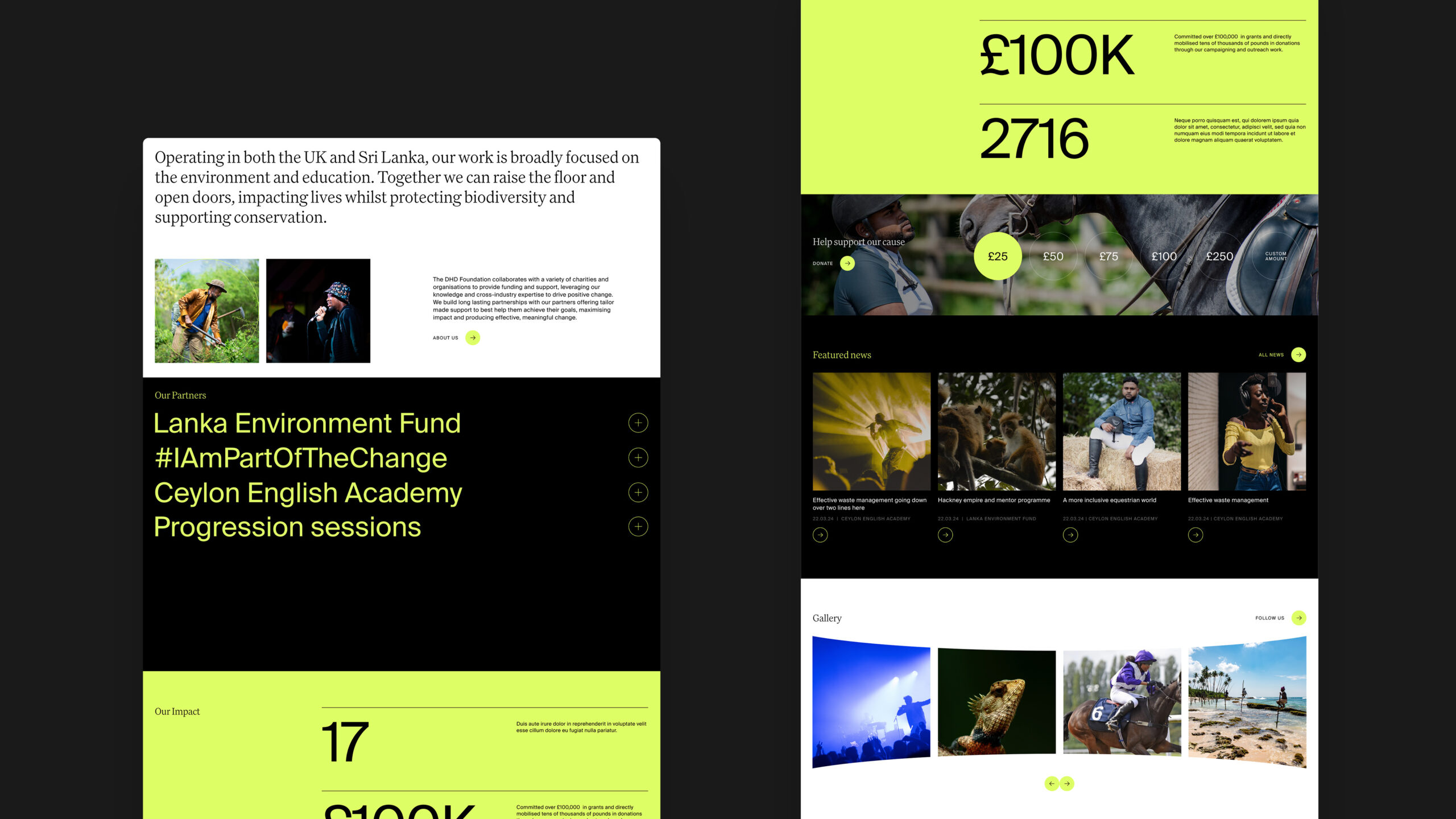
The brand system centres around a striking black and vibrant yellow palette — confident, contemporary and full of intent. Paired with clean, modern type and an elegant line-based logo that nods to connection and direction, it’s a look that feels as at home in the environmental space as it does in education.
Stunning, human-centred photography brings a strong emotional connection, while a flexible grid system and simplified messaging help unify the Foundation’s wide-ranging work under one cohesive voice.
The logo is inspired by the Vesica Piscis, a geometric shape formed by the overlap of two circles. Traditionally a symbol of unity, potential and transformation, the perfect fit for a foundation focused on partnership and long-term impact. It also subtly echoes the idea of paths crossing and new futures being formed.
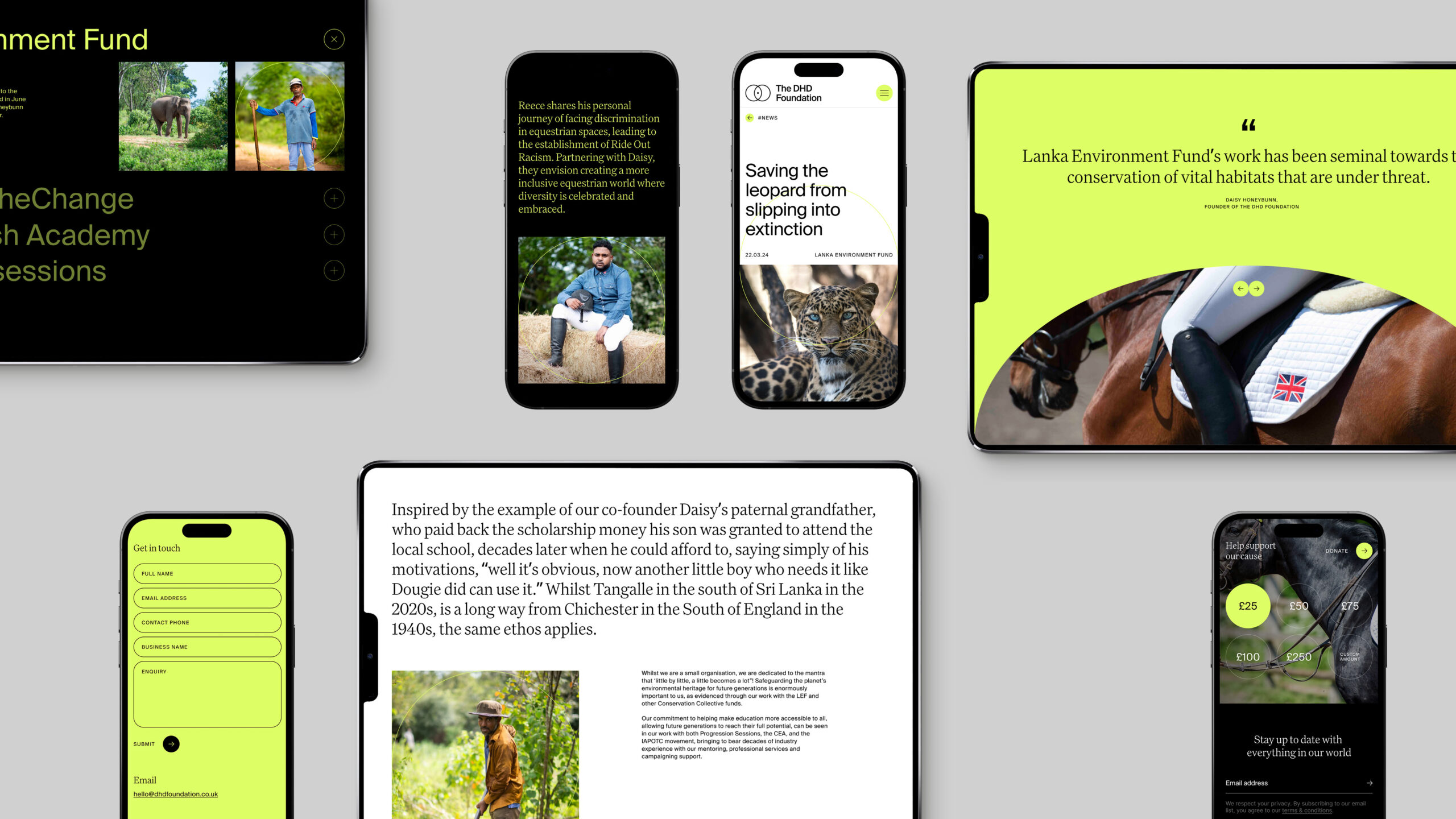
The website
The new website is more than a digital brochure, it’s a window into the world the Foundation is helping to shape. Built on WordPress, it’s fully responsive, easy to manage, and future-ready. The content structure gives space for storytelling, impact reporting, and the opportunity to showcase the Foundation’s growing list of partners. It also invites new potential collaborators to get in touch and learn more. We kept the user experience clean and intuitive, letting the content shine and guiding visitors through the Foundation’s vision, values and the difference they’re making.
The outcome
The new identity has helped the Foundation move forward with confidence. It’s modern, distinctive and built around a clear narrative giving Daisy, Pravin and the team a stronger platform to build partnerships, share their impact, and shape more futures together.